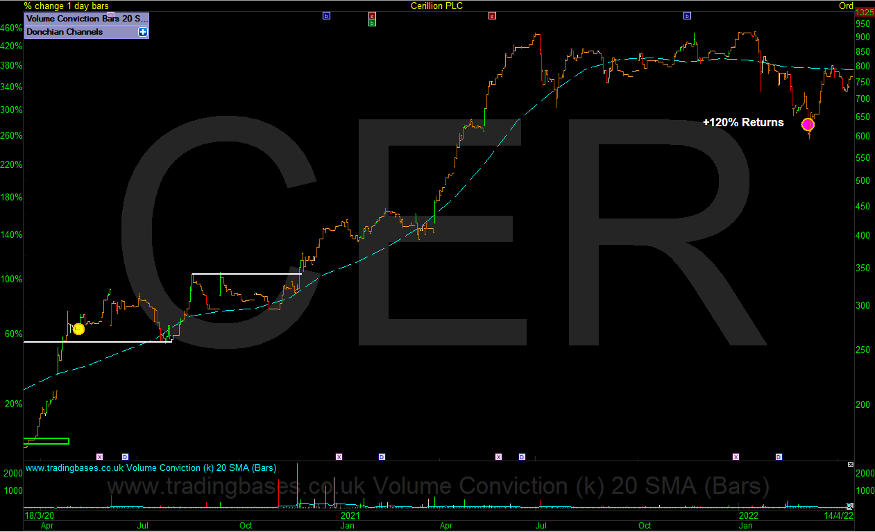
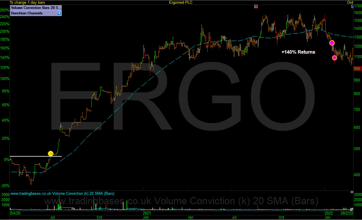
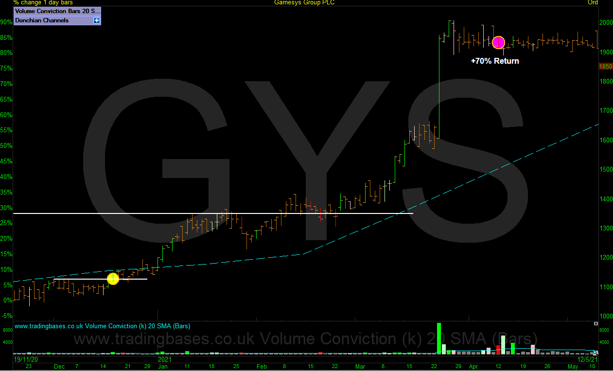
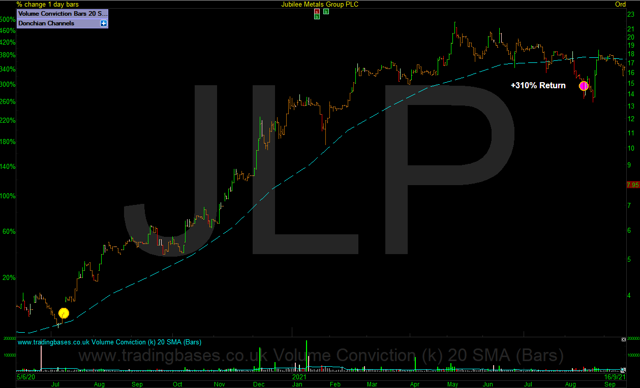
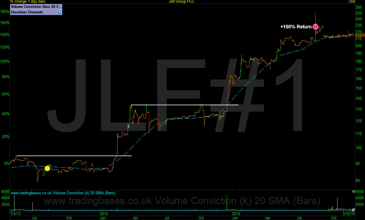
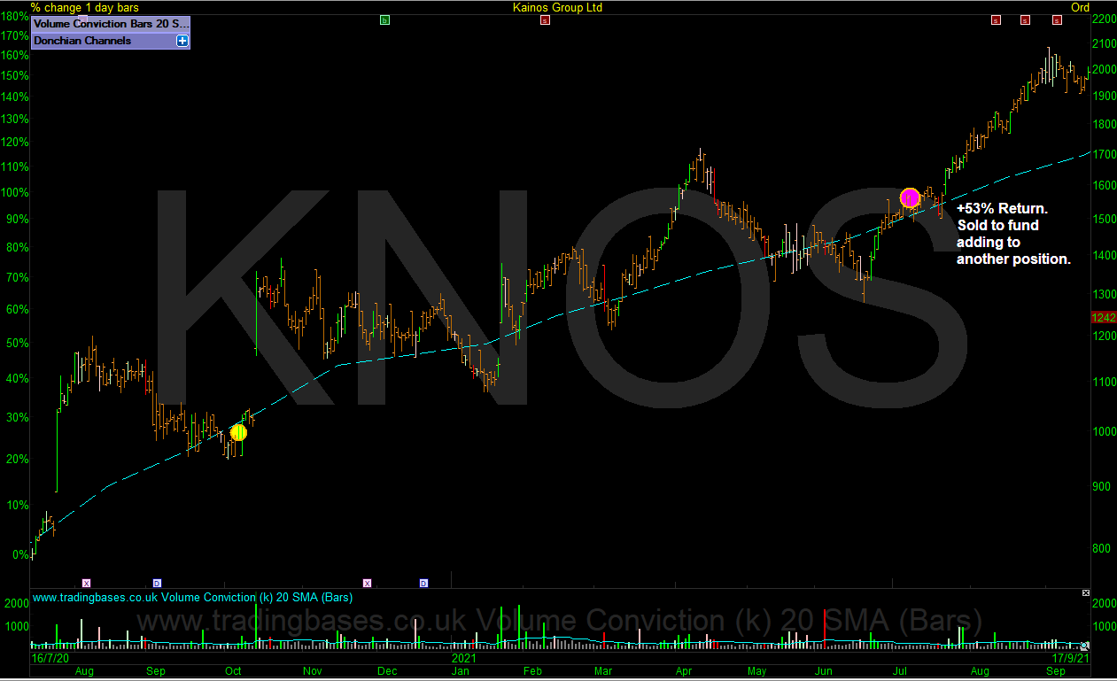
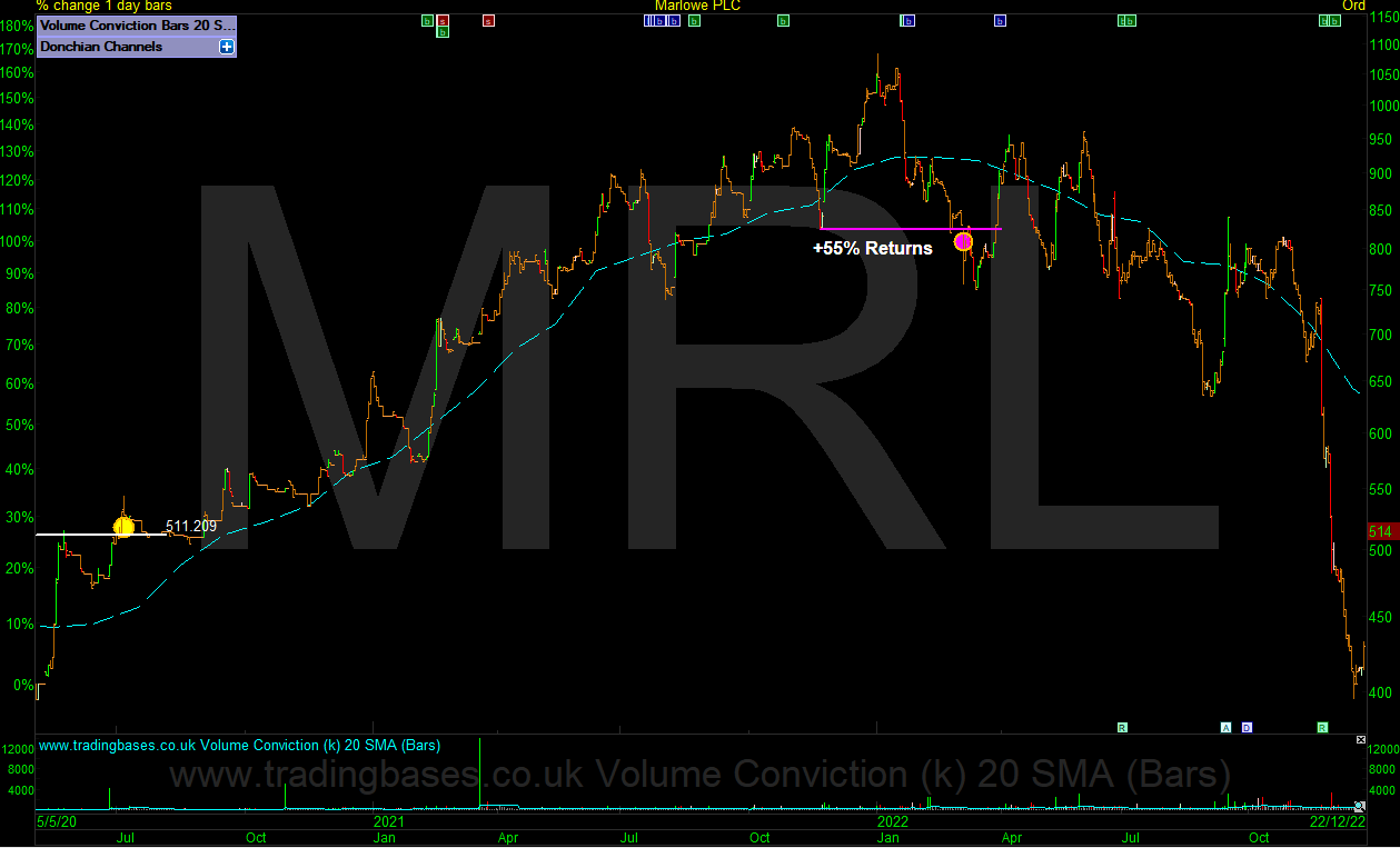
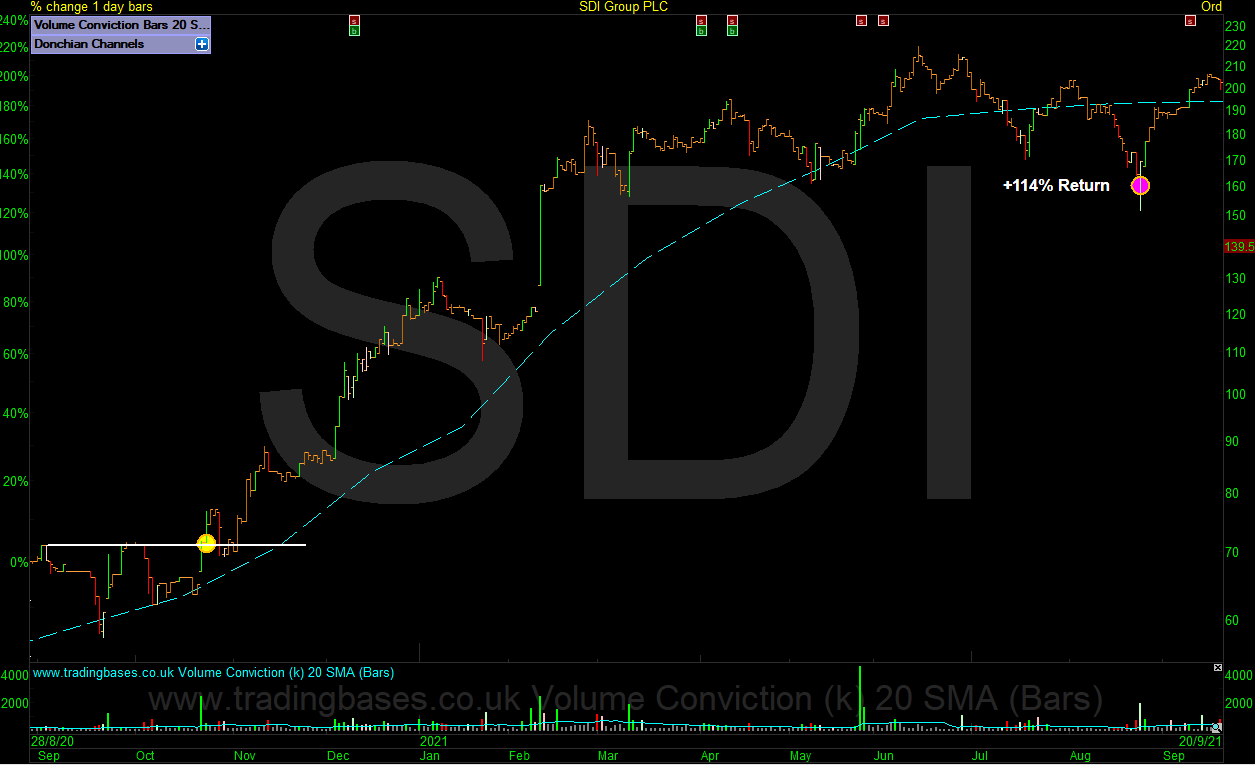
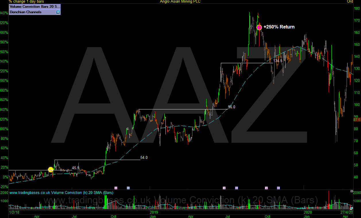
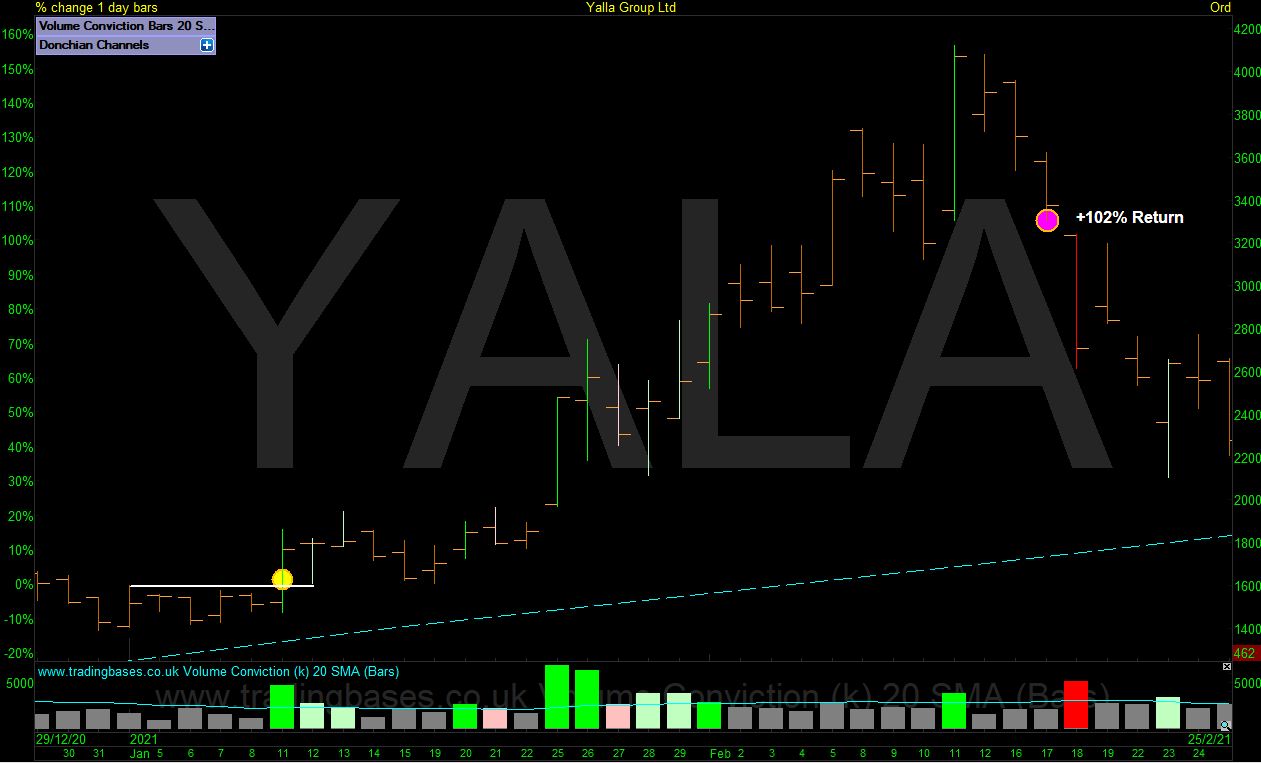
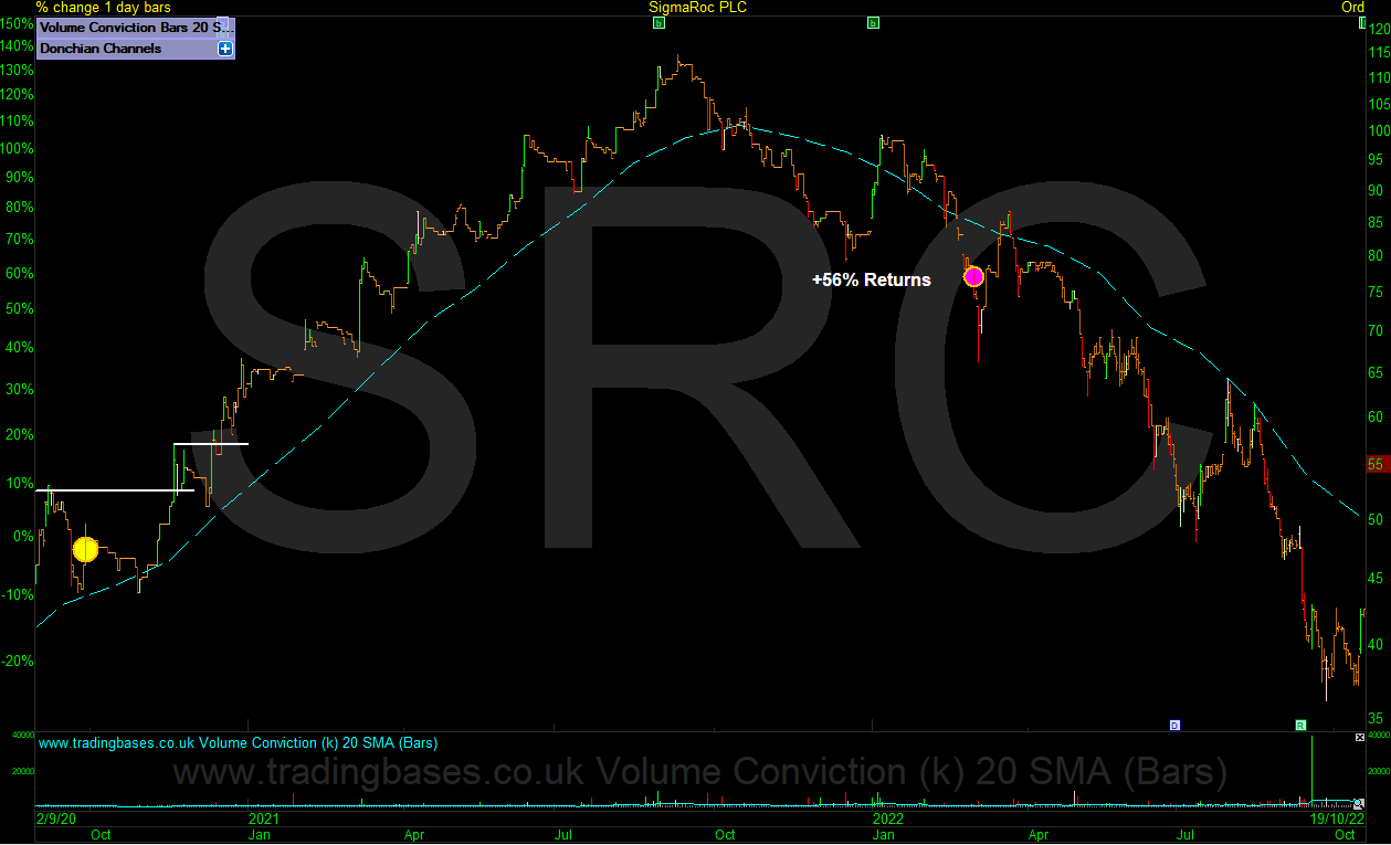
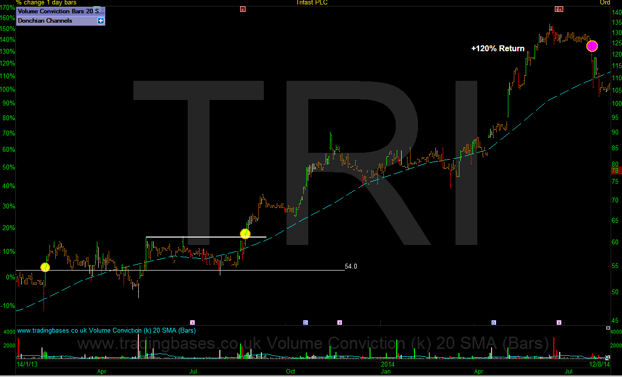
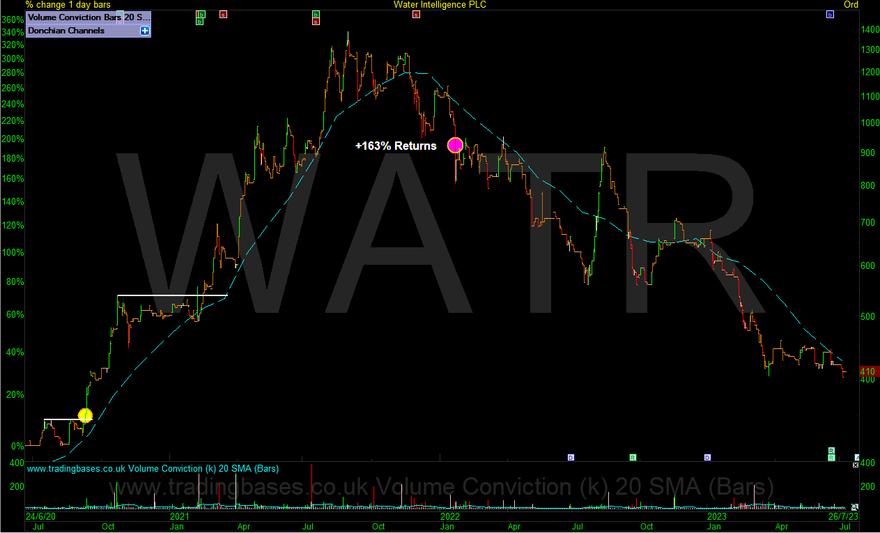
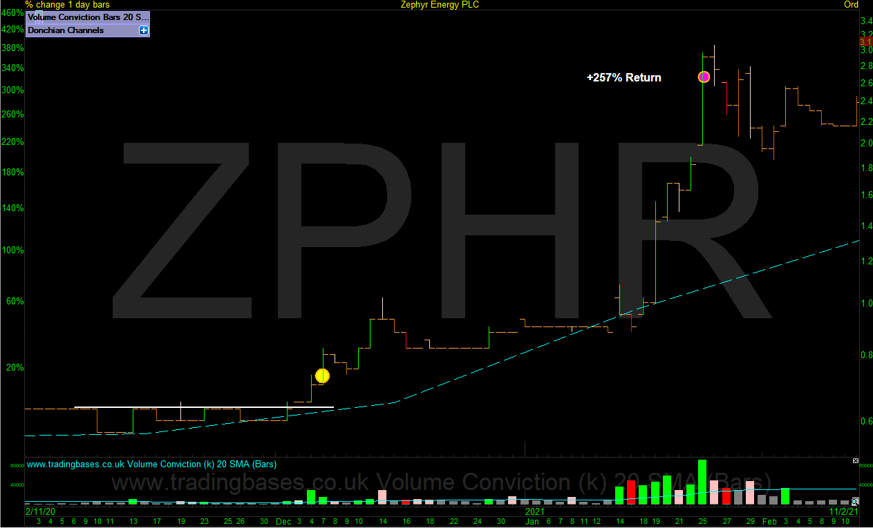
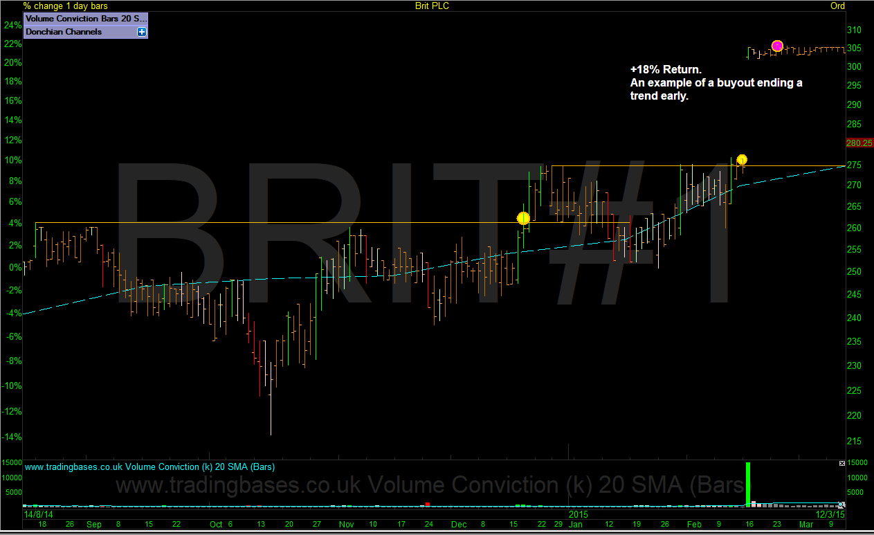
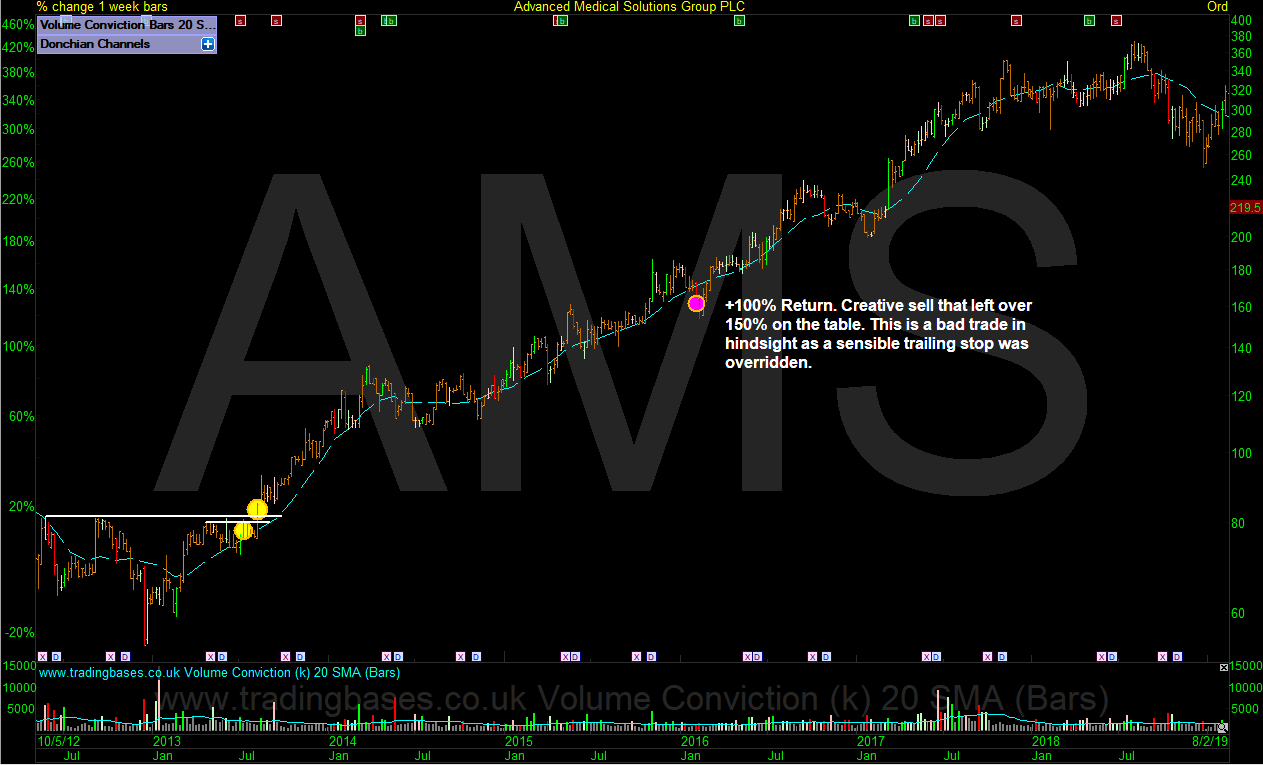
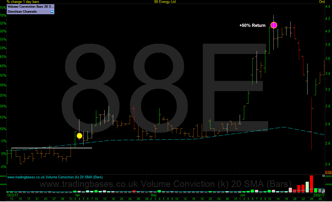
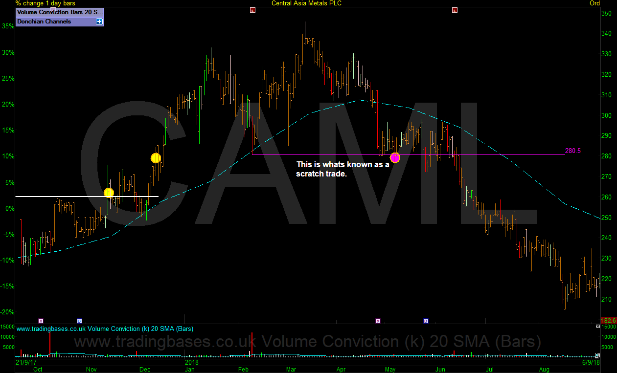
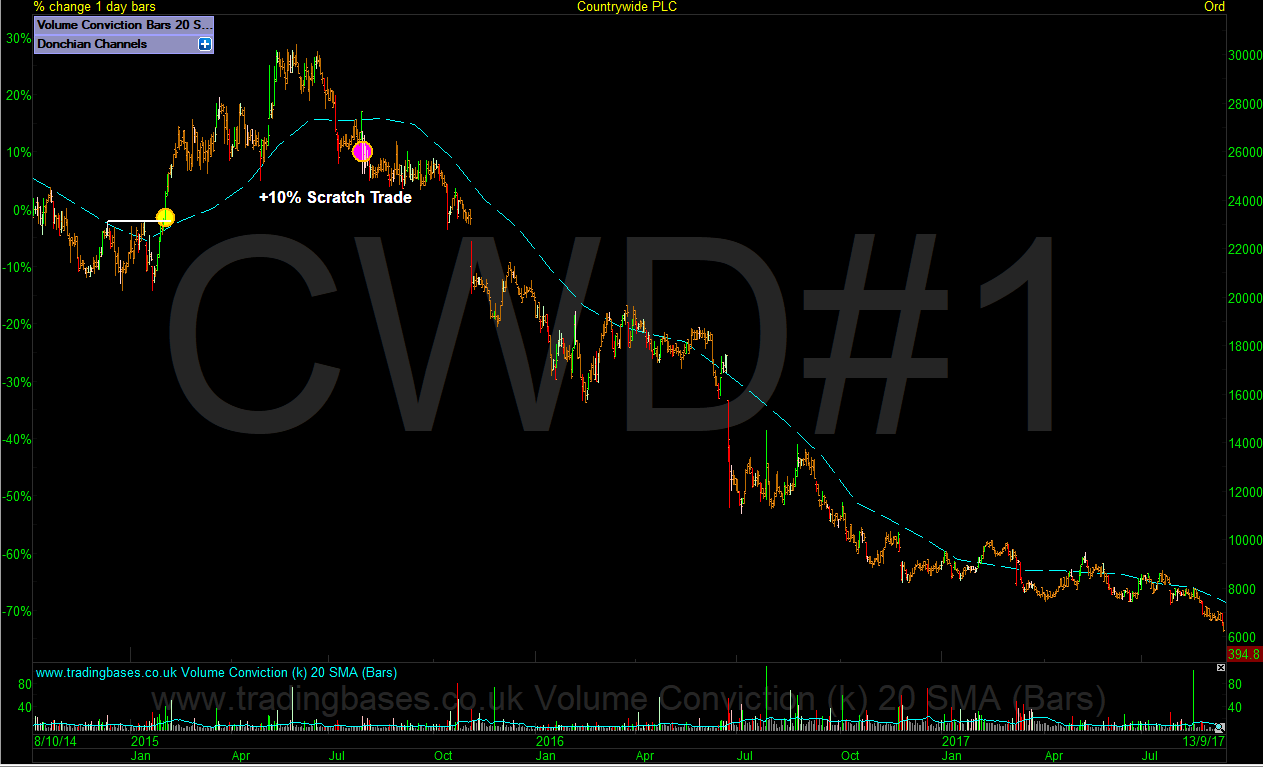
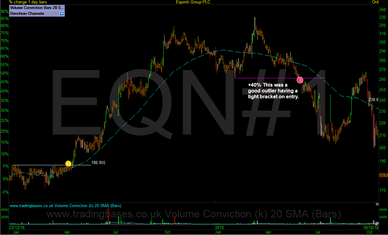
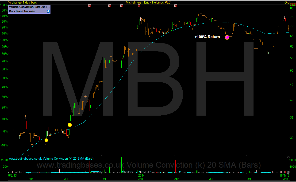
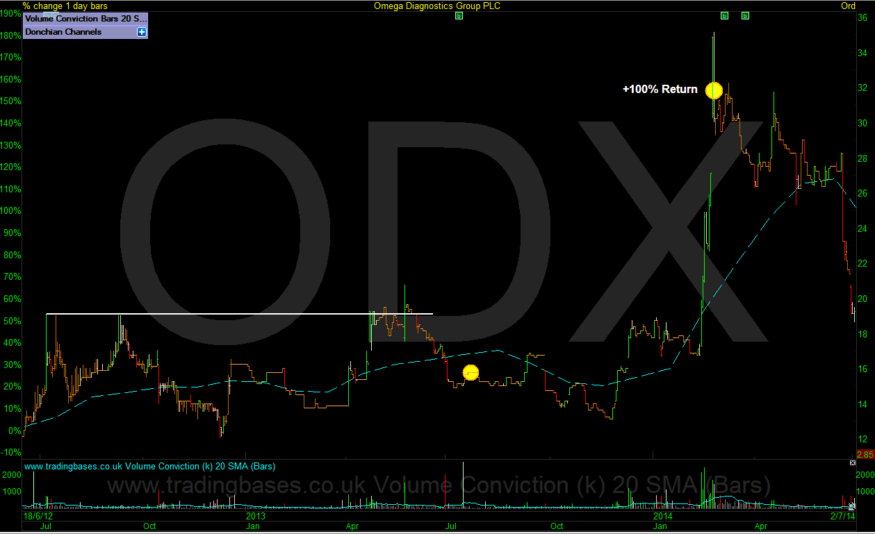
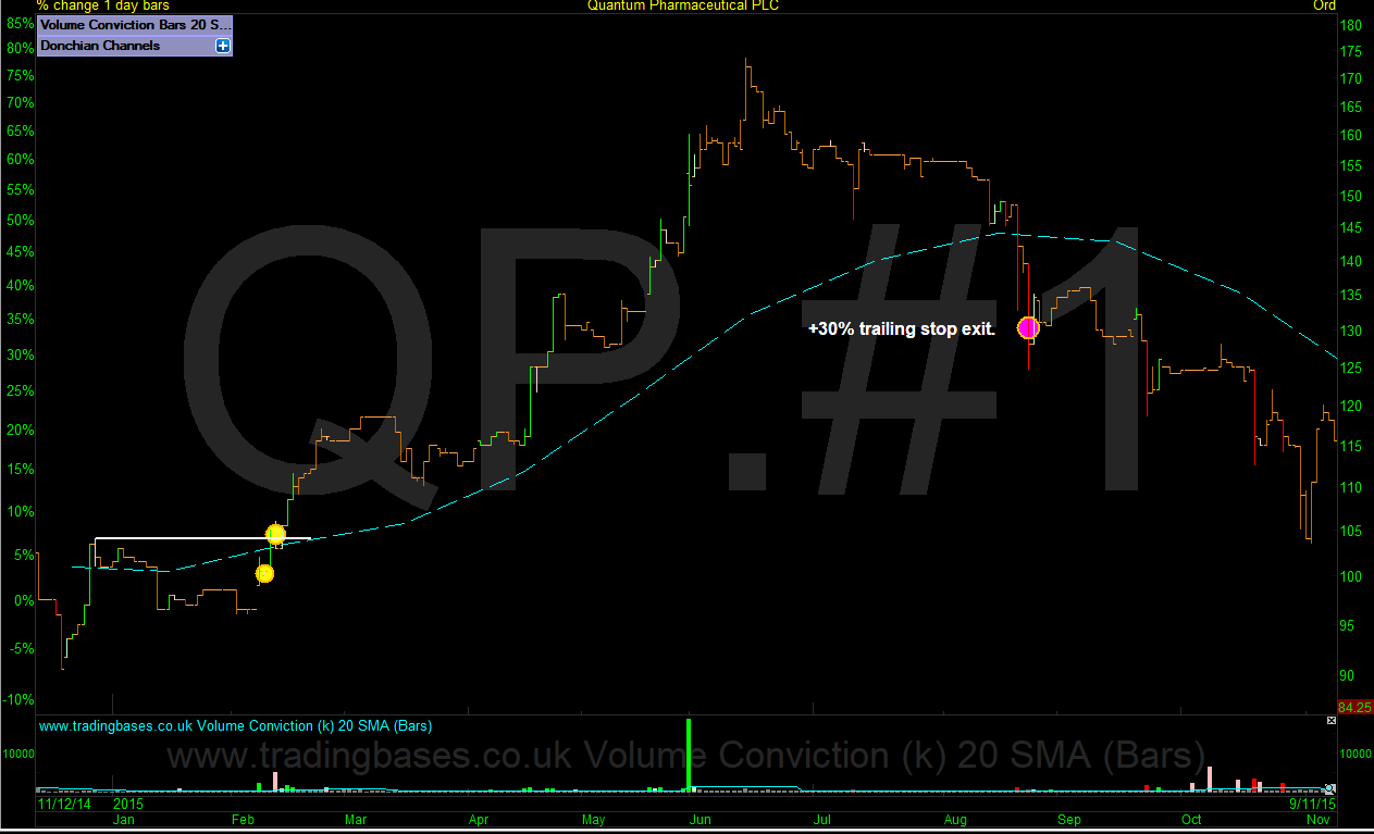
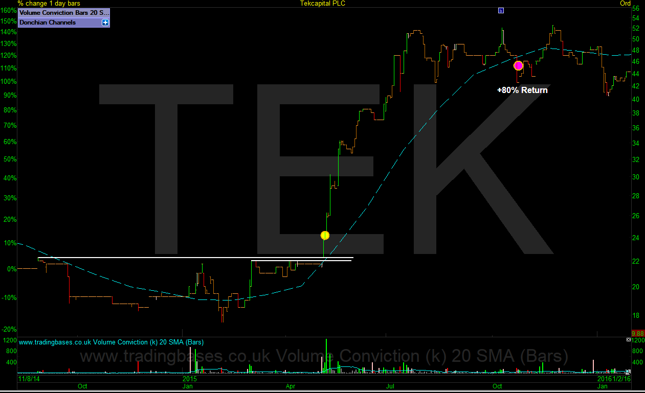
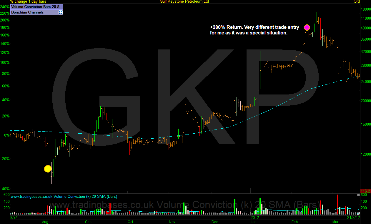
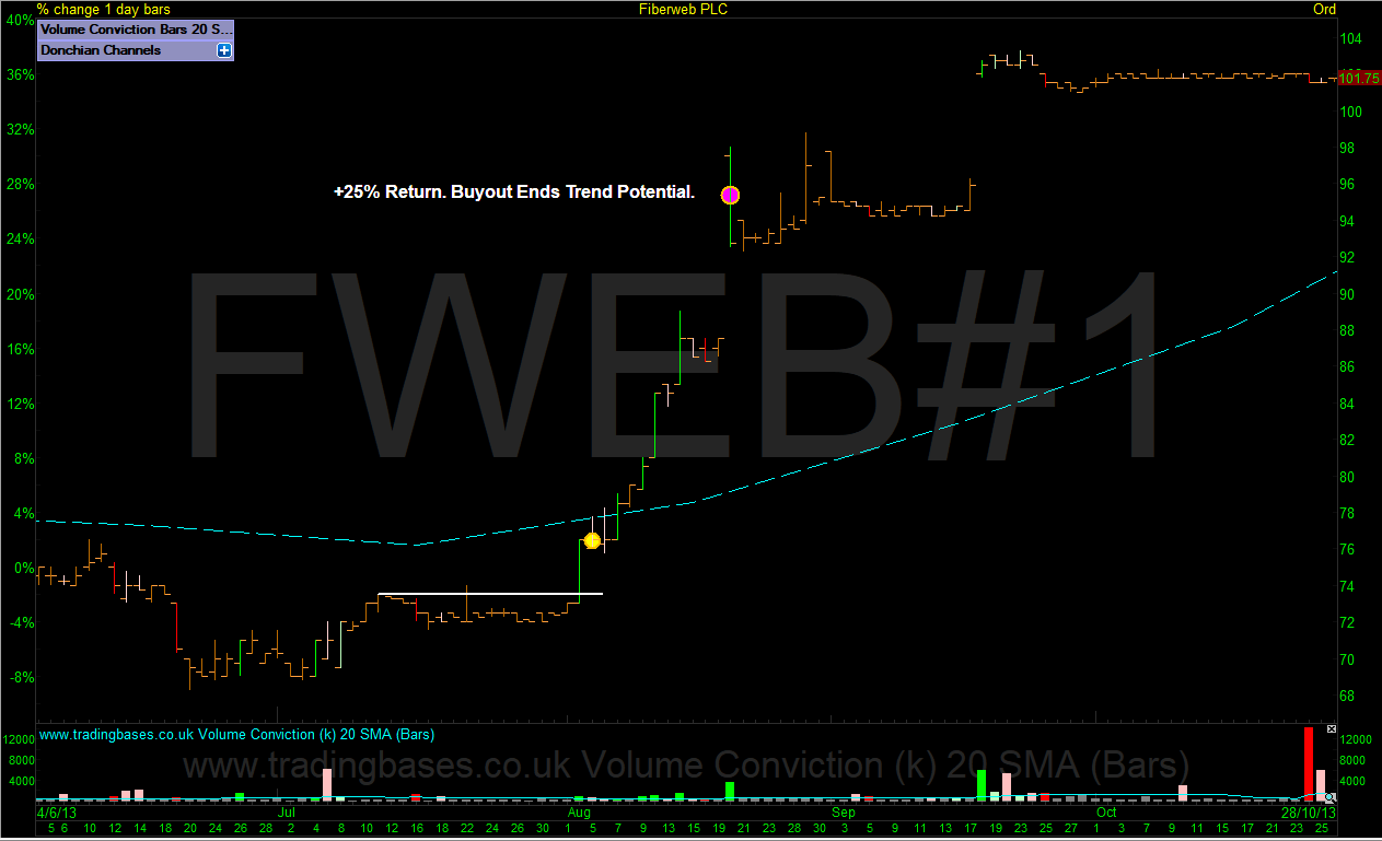
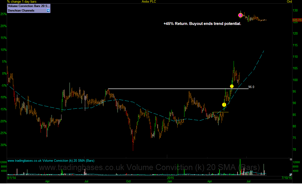
The charts below will give you a clearer idea of the longer primary trend timeframe I like to capture as opposed to my shorter more active swing style moves that I trade. The primary trend is targeting months to years. An outlier tends to have an average life span of around 10 to 18 months. I've also loaded some higher risk small cap trades that are mostly sold into a strong move.
Entries and exits are marked with yellow and pink circles. All trades were taken and can be verified. I've annotated the first entry and last exit of the position. Multiple entries are made as I add to winners and some positions will have been vol targeted (partial profits taken) The % move is actually not as important as the multiples of risk captured on the trade (R multiples) Any trade up in the high single digits (in R) and above would be considered an outlier and in trading as in investing its the outliers that make the difference. All losing trades will be minus 1R or less (plus or minus slippage)
Entries and exits are marked with yellow and pink circles. All trades were taken and can be verified. I've annotated the first entry and last exit of the position. Multiple entries are made as I add to winners and some positions will have been vol targeted (partial profits taken) The % move is actually not as important as the multiples of risk captured on the trade (R multiples) Any trade up in the high single digits (in R) and above would be considered an outlier and in trading as in investing its the outliers that make the difference. All losing trades will be minus 1R or less (plus or minus slippage)